


How do we design a new everything?

The eSafety Commissioner outgrew its original purpose. A department that started for the children (Office of the Children’s eSafety Commissioner) got a new remit, policy and legislation. Their new users were to be from the cradle to the grave. (eSafety Commissioner) This case study covers the navigation for the new site.
This would be the entire lifecycle - new brand, new audiences, new CMS, new everything.

This was done by selecting a new CMS. It required a migration from the outdated CMS (Sitecore) to a more flexible and dynamic CMS (Drupal) and a PaaS-driven environment by the Department of Finance.
With the new CMS came new SEO and WCAG requirements. Content creators could start fresh with killer content, all the right keywords, knowing the search intent and the in-page linking done correctly.
Segmentation of audiences and a clear IA without repetition in naming conventions fed into unique decisions on displaying the navigation for 600 pages at launch with the vision of many more to come.
A new name, a new brand, new audiences, and how to look like a cohesive brand while speaking to each audience—this was the birth of the Design System. (This was a separate project that ran simultaneously)
Due to the nature of the site's topics, the User Interface needed to be fresh, new, approachable and not government-looking. (This was a separate project that ran simultaneously)
How do we segment audiences, and where do you draw the line? How do we present the navigation, audience or topic-based?
Why would you put Women and Domestic and Family Violence in the same segment when it’s not only women who are affected by this terrible issue? At what age does a kid become a teenager? Where do we split topics for kids vs teens? Should a 12-year-old be reading information about pornography and sending nudes? Why have a segment called women and not one for men? These were only just the beginning.
There is a lot of topic crossover in the content. How we would present the content to a senior would vastly differ from that of a teenager. Each group would call topics by different names, and there would be the possibility of vast reading levels. We also wanted a safe space for the kids to go to where they wouldn’t read about things like porn or nudes.
Kids
Teens
Internal stakeholders (SME)
External stakeholders
Management
A card sorting activity was undertaken office-wide. This helped identify the audience segments and any crossover within them. eSafety’s staff are highly knowledgeable, which helped us ensure we didn’t forget about any topic or user.
Once the initial segments were agreed upon, a new brand was created to reflect the users within each segment. Feedback from internal stakeholders was implemented, and they also used their external stakeholder relationships to help feed into it.
We derived one set of personas from user complaints reported through eSafety’s site. These personas informed the content around topics like cyberbullying, revenge porn as well as child sexual abuse material. Personas were derived from a survey co-developed with the SMEs for the educational topics. These personas fed into the parts of the site that were more focused on kids and schools.
Due to minimal funding, only one face-to-face user test was conducted. The Kids' user group was chosen because this was different from an audience previously catered to. The focus group was in a classroom with a grade 3 class; this particular school was selected due to the area's low socioeconomic status and the unique way it forces students to interact with technology.
Decision point - navigation would be audience-based. Once this decision was made about audience vs topic, it was much easier to focus on how to approach what sort of focus groups we could have.

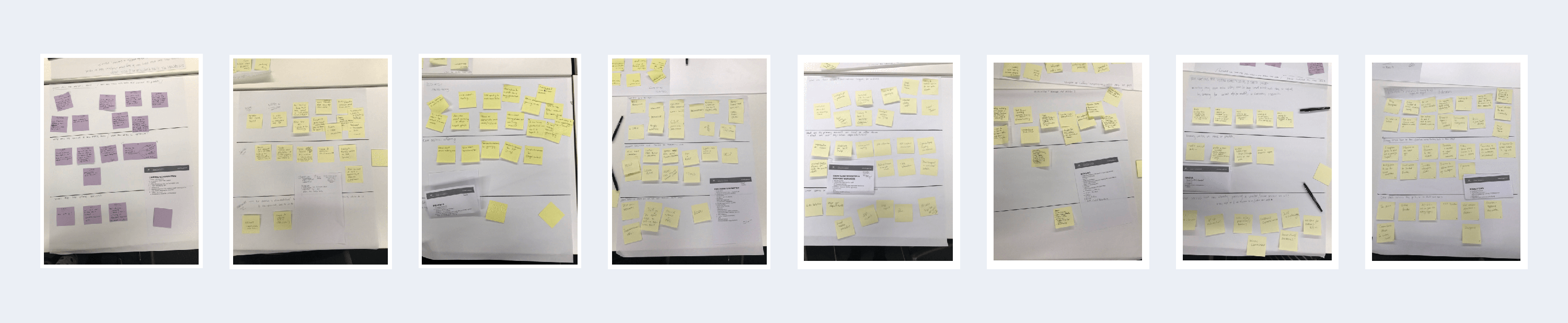
There was only one way to see if the navigation would work. Nine different prototypes were created.
600 pages. Six levels deep.
Through multiple prototypes, I came up with the solution that we were to break the navigation into segments. Each segment had to behave independently as its own site yet seamlessly integrate to deliver a cohesive user experience. Low-fidelity prototypes were created to validate design decisions, and they were subjected to rigorous testing and iteratively refined based on user feedback. The solution I came up with was implementing a top-level navigation that allowed movement between the segments.
Each page on the site had to have an imprint of the left-hand navigation. This meant it could not work independently with an accordion, like we had initially wanted it to, and it could be a max of 5 pages deep once in the segment. It took some time to get a final design that adhered to this requirement and would only show the parent, sibling and child.
We rigorously tested multiple prototypes I created in-house with the project team and selected SMEs, ensuring every page could be reached and that when you got there, you would always know where you were on the site. Each tester was assigned a persona with multiple pages they needed to reach. They also had a set of questions that they had to complete as they progressed through the content. This helped ensure they hit the targets we had requested.
On top of this, a separate mobile nav needed to be designed and prototyped. (This was a separate project that ran simultaneously)
At the last count, the eSafety website had expanded to four more segments and now has around 1500 pages, and the navigation is still working.
New everything We had to create the front and back ends of the CMS. Many hours were spent writing and refining requirements that allowed content editors to use the CMS and have it magically appear themed on the front end. Content type—Paragraph type—Entity Reference—Widgets.
We partnered with an external agency of skilled back-end developers, content writers, seasoned project managers, and technical product owners to complement our in-house expertise. Their extensive experience in Drupal and knowledge helped us deliver an award-winning site.
An external user feedback widget was used post-go-live to gather feedback on the product, service, and system. Heat mapping tools and digital marketing tools were also plugged in to help guide any future updates to the UX and content.
eSafety was awarded an Honoree Winner at the 2020 Webby Awards in the Government and Civil Innovation category. Webby Awards Executive Claire Graves said receiving an honouree award was a huge achievement.“Honourees like eSafety are setting the standard for innovation and creativity on the Internet.”
I wore many hats on the project, including UI, UX, PO, Product Manager, brand, data visualisation, and delivery.

